
Introduction
Brick City, Missouri State University’s School of Fine Arts, is located just a few blocks from campus in a former cheese manufacturing plant that once served as
a refrigerator. After a remodel, the space now showcases its history, featuring upcycled furniture and a maximalist design with exposed brick throughout.
a refrigerator. After a remodel, the space now showcases its history, featuring upcycled furniture and a maximalist design with exposed brick throughout.
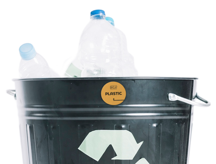
However, with creativity comes waste. While recycling is available, the upcycled nature of the space makes it challenging to locate proper bins, as many are marked with makeshift labels. In the rush between classes, finding the right recycling spot can be difficult.
Introducing Brick City Recycling: a wayfinding system designed to help students easily identify recycling bins and reduce waste.
Logos & Pattern
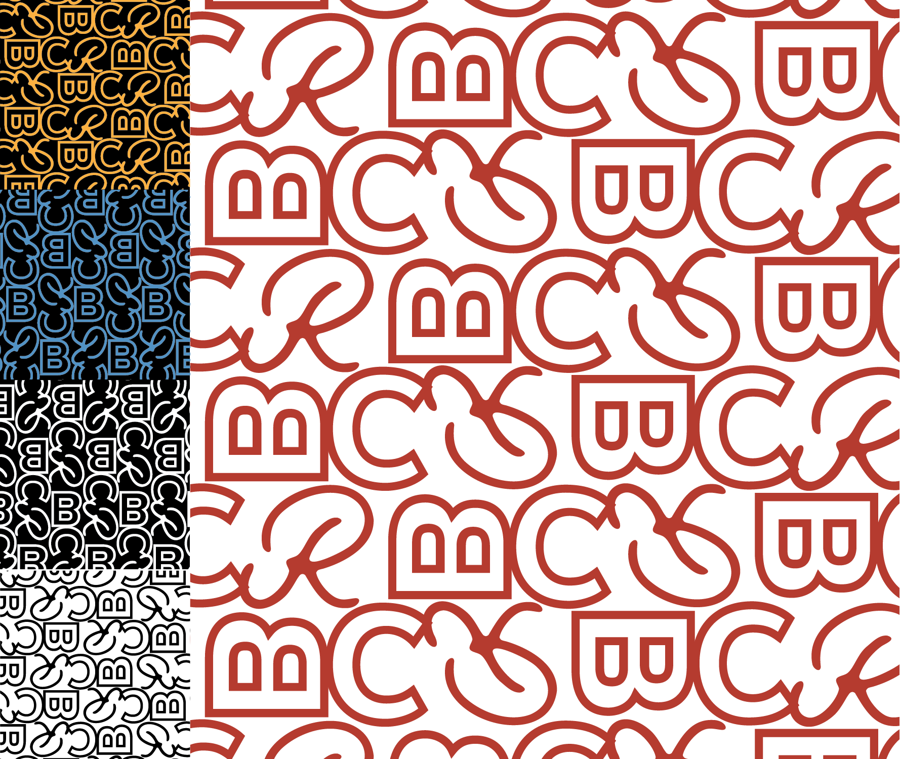

Inspiration
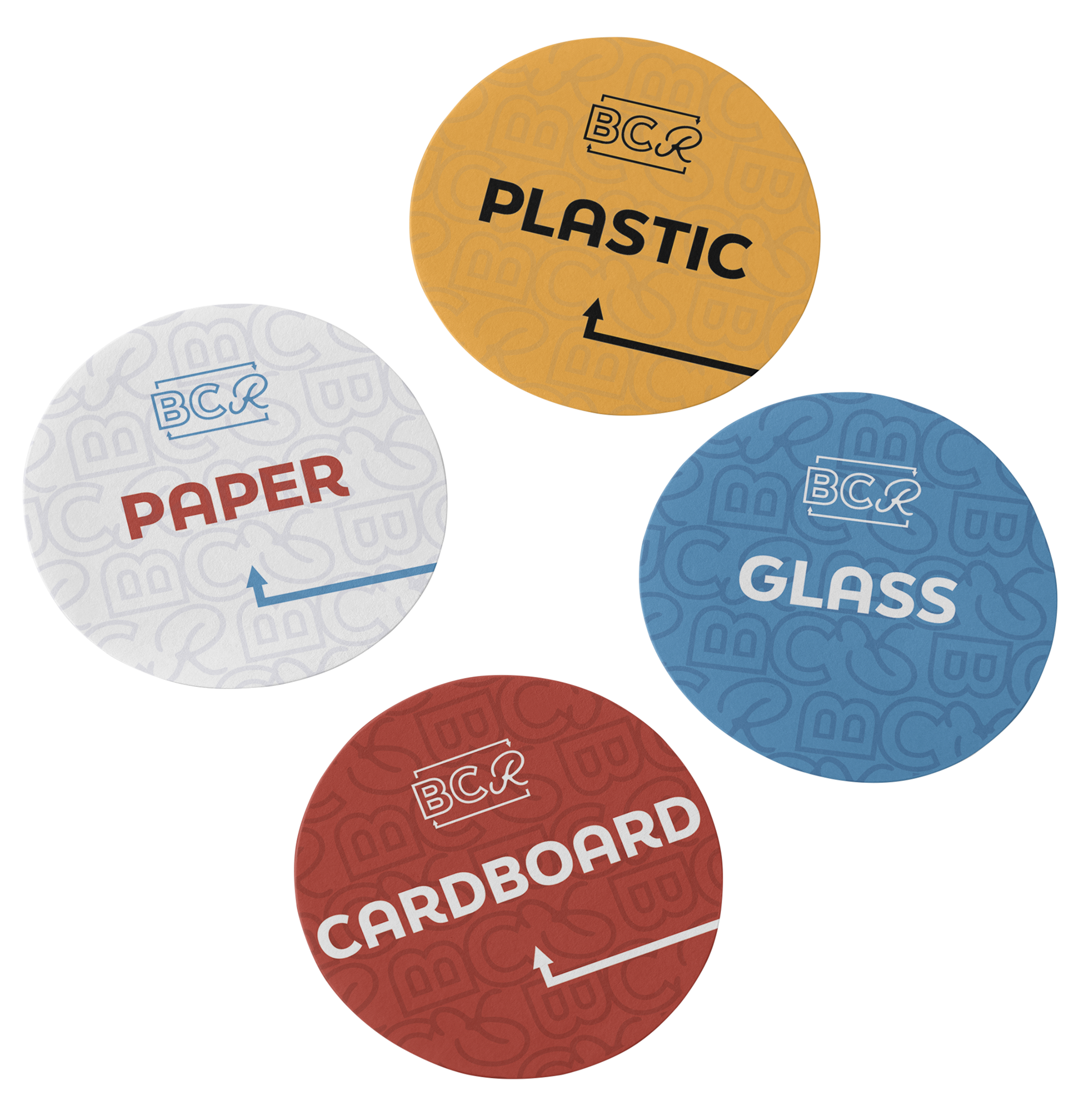
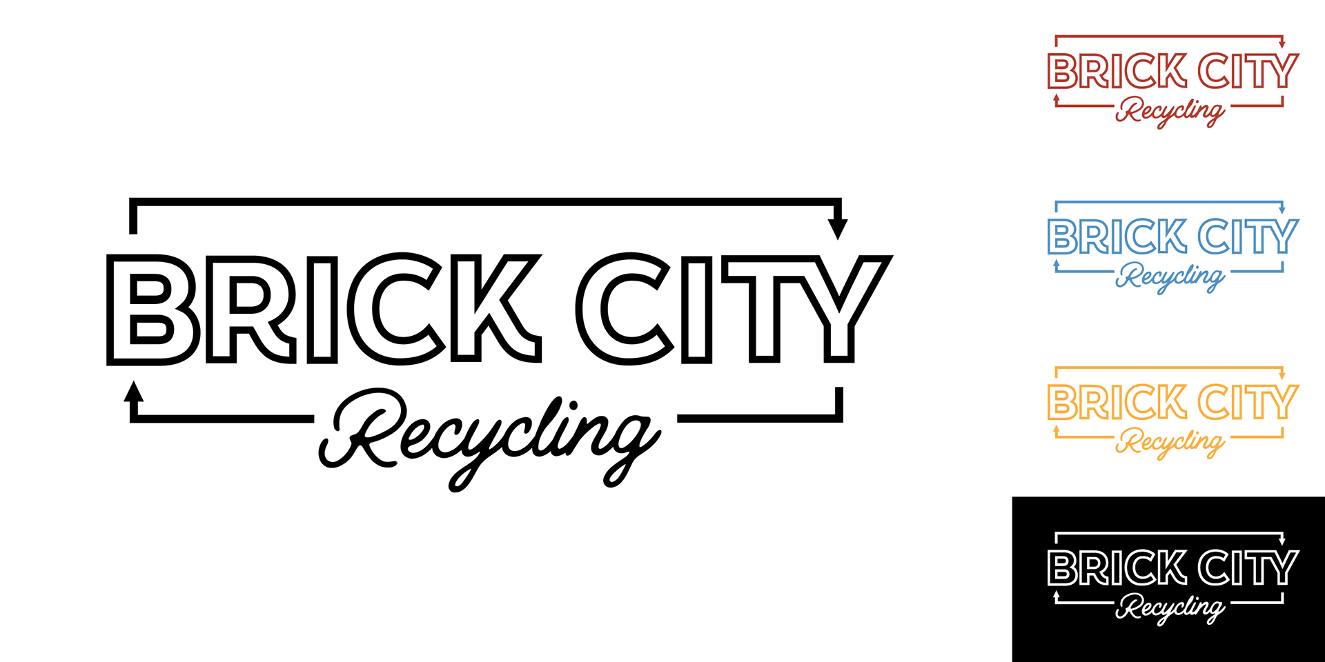
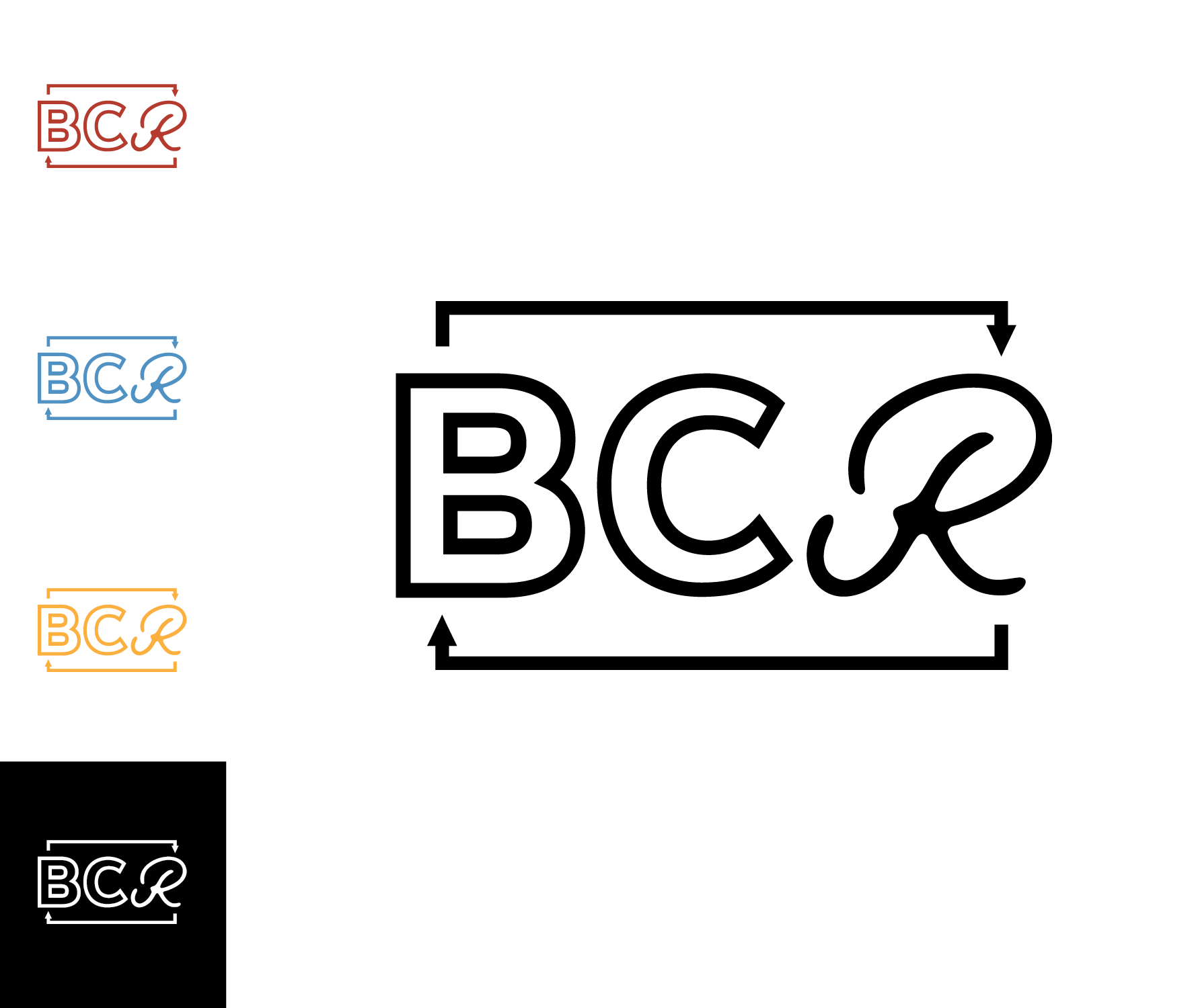
The main logo appears on promotional posters and TVs in common areas, notifying students about the new recycling wayfinding system in Brick City. The acronym logo is used on labels to avoid competing with the primary information, such as the type of waste being recycled.
My design took inspiration from the vintage flare of Brick City's buildings. Referencing old machinery logos (see above) and shop jackets, I created the logo. I included the arrow as part of a reimagined recycling symbol.
Brand in action